
The Importance of Mobile Web Design
In today’s digital age, the use of mobile devices has become ubiquitous. With more and more people accessing the internet through smartphones and tablets, having a mobile-friendly website is no longer just an option – it’s a necessity.
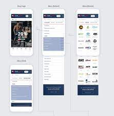
Mobile web design refers to the practice of creating websites that are optimised for viewing on mobile devices. This involves ensuring that the site layout, content, and features are all easily accessible and usable on smaller screens.
Why is Mobile Web Design Important?
User Experience: A well-designed mobile site provides users with a seamless and enjoyable browsing experience. It ensures that visitors can easily navigate your site, find information quickly, and complete actions such as making a purchase or filling out a form without frustration.
SEO Benefits: Search engines like Google prioritise mobile-friendly websites in their search results. Having a responsive design that adapts to different screen sizes can improve your site’s ranking and visibility in search engine results pages.
Increased Engagement: Mobile users tend to have shorter attention spans than desktop users. By offering a mobile-optimised experience, you can capture their interest and keep them engaged with your content or services.
Best Practices for Mobile Web Design
– Use responsive design techniques to ensure your site looks good on all devices.
– Prioritise speed by optimising images and minimising server requests.
– Keep navigation simple and intuitive for touchscreens.
– Make calls-to-action prominent and easy to tap.
Conclusion
Mobile web design is not just about creating a smaller version of your desktop site – it’s about providing users with a tailored experience that meets their needs on the go. By investing in mobile-friendly design, you can enhance user satisfaction, improve search engine visibility, and ultimately drive more conversions for your business.
Essential FAQs on Mobile Web Design: Key Insights and Best Practices
- What is mobile web design?
- Why is mobile web design important?
- How does mobile web design differ from desktop web design?
- What are the benefits of responsive design for mobile websites?
- How can I make my website mobile-friendly?
- What impact does mobile web design have on user experience?
- Does mobile web design affect search engine optimisation (SEO)?
- What are common challenges in designing for multiple screen sizes in mobile web design?
- Are there any best practices or guidelines for creating a successful mobile website?
What is mobile web design?
Mobile web design refers to the process of creating websites that are specifically optimised for viewing and interacting on mobile devices such as smartphones and tablets. It involves designing websites with a responsive layout that adapts to different screen sizes, ensuring that users have a seamless and user-friendly experience when accessing the site on their mobile devices. Mobile web design focuses on making navigation easy, content accessible, and features functional on smaller screens, ultimately enhancing the overall usability and engagement for mobile users.
Why is mobile web design important?
Mobile web design is crucial in today’s digital landscape due to the widespread use of mobile devices for internet browsing. With a significant portion of web traffic coming from smartphones and tablets, having a mobile-friendly website is essential for providing users with a seamless and enjoyable browsing experience. A well-designed mobile site ensures that visitors can easily access information, navigate the site effortlessly, and complete desired actions without any hindrances. Moreover, prioritising mobile web design can improve search engine rankings, increase user engagement, and ultimately drive conversions for businesses looking to succeed in the competitive online space.
How does mobile web design differ from desktop web design?
When considering the difference between mobile web design and desktop web design, it is essential to understand that the primary distinction lies in the user experience and interface. Mobile web design focuses on creating a layout and content structure that is optimised for smaller screens, touch interactions, and on-the-go browsing. This often involves simplifying navigation, prioritising key information, and ensuring fast loading times. In contrast, desktop web design allows for more intricate layouts, richer graphics, and hover interactions due to the larger screen size and precision of mouse input. Adapting these design elements to suit the specific needs and behaviours of mobile users is crucial in creating a seamless and engaging experience across different devices.
What are the benefits of responsive design for mobile websites?
Responsive design for mobile websites offers a multitude of benefits that cater to the modern digital landscape. Firstly, it ensures a consistent and seamless user experience across various devices, regardless of screen size or orientation. This adaptability not only enhances user satisfaction but also boosts engagement and encourages longer site visits. Additionally, responsive design contributes to improved search engine rankings, as search engines like Google favour mobile-friendly websites. By embracing responsive design, businesses can effectively reach and engage with their audience on mobile devices, ultimately driving conversions and achieving their digital goals.
How can I make my website mobile-friendly?
To make your website mobile-friendly, there are several key steps you can take. Firstly, consider implementing a responsive design that automatically adjusts the layout and content of your site to fit various screen sizes. This ensures a consistent user experience across different devices. Optimising images and other media for faster loading times on mobile devices is also crucial. Simplifying navigation, using larger font sizes, and making buttons easy to tap with fingers are additional measures to enhance usability on mobile. Regularly testing your site on different mobile devices and browsers can help identify any issues that need addressing to ensure optimal mobile performance.
What impact does mobile web design have on user experience?
Mobile web design plays a crucial role in enhancing user experience on mobile devices. A well-optimised mobile site ensures that users can easily navigate, interact, and access information seamlessly on their smartphones or tablets. By providing a responsive design that adapts to different screen sizes, mobile web design improves usability and readability, leading to increased engagement and satisfaction among users. A user-friendly mobile experience not only keeps visitors on the site longer but also encourages them to take desired actions, such as making a purchase or filling out a form, ultimately contributing to a positive overall user experience.
Does mobile web design affect search engine optimisation (SEO)?
Mobile web design has a significant impact on search engine optimisation (SEO). Search engines like Google prioritise mobile-friendly websites in their rankings, meaning that having a responsive design that adapts to different screen sizes can improve your site’s visibility and performance in search results. By ensuring that your website is optimised for mobile devices, you not only provide a better user experience but also increase the likelihood of attracting more organic traffic to your site through improved SEO rankings.
What are common challenges in designing for multiple screen sizes in mobile web design?
Designing for multiple screen sizes in mobile web design presents several challenges. One common issue is ensuring that the website layout remains visually appealing and functional across various devices, from small smartphones to larger tablets. Maintaining consistency in design elements such as fonts, images, and navigation can be tricky when accommodating different screen resolutions. Another challenge is optimising the user experience to ensure that content is easily accessible and readable on all screen sizes without compromising usability. Balancing aesthetics with responsiveness is key to overcoming these challenges and creating a seamless browsing experience for users across different devices.
Are there any best practices or guidelines for creating a successful mobile website?
When it comes to creating a successful mobile website, following best practices and guidelines is crucial. Designing with a mobile-first approach, implementing responsive design techniques, optimising for speed and performance, simplifying navigation for touchscreens, and making calls-to-action prominent are all key elements to consider. By adhering to these principles, you can ensure that your mobile website provides users with a seamless and engaging experience, ultimately leading to increased user satisfaction and improved business outcomes.