
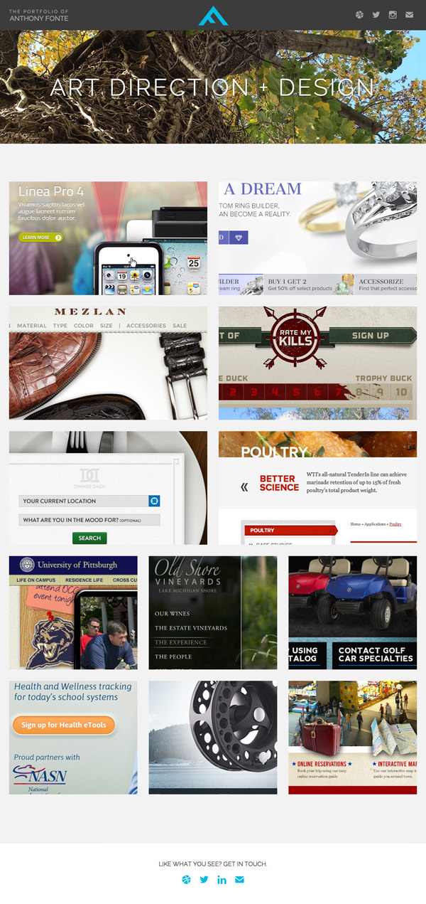
One-Page Web Design: A Complete Guide
One-page web design brings a website’s main content together on a single page. Instead of navigating between separate pages, visitors scroll through clearly organised sections to find information, explore services and take action. When planned well, this approach can make a website feel simple, focused and easy to use.
But a one-page website is not the right choice for every business. The best design depends on what your visitors need and how much information you have to share. Here’s what to consider before choosing a one-page layout.
What is one-page web design?
A one-page website presents its core content on one URL. Sections might include an introduction, services, benefits, testimonials, frequently asked questions and contact details. A navigation menu typically links to these sections, taking visitors directly to the relevant part of the page.
One-page design is sometimes confused with a landing page. A landing page is usually created for a specific campaign or goal, while a one-page website can introduce an entire business, product or portfolio.
Benefits of a one-page website
A clear, focused journey
With fewer pages to navigate, visitors can follow a straightforward path from learning about an offer to deciding what to do next. This can work particularly well for a business with one main service, a product launch or an event.
Simple navigation
Section links can help people jump to the information they want without searching through multiple menus. A compact navigation bar may also keep the page feeling uncluttered on desktop and mobile devices.
A cohesive story
Content can be arranged to guide visitors through a natural sequence: what you offer, who it helps, why it matters and how to get in touch. Thoughtful transitions between sections can make this experience feel joined-up and engaging.
Efficient to maintain
For a small site with limited content, managing one page may be simpler than maintaining several. Updates to contact information, services or calls to action can be made in one central place.
Potential drawbacks
Limited room for detailed content
A single page can become difficult to scan if it needs to cover many services, locations or topics. Visitors may have to scroll through a great deal of content, and important details can be hard to find.
Search visibility needs careful planning
Separate pages can target different subjects and search queries. A one-page site has fewer individual URLs to work with, so it may be less suitable for businesses that need to build visibility across a wide range of topics. Strong headings, useful copy, descriptive page titles and a clear site structure still matter.
Page length and performance
Combining content, images and animations on one page can affect loading speed, especially on mobile connections. Use appropriately sized images, avoid unnecessary effects and test the page on a range of devices.
Analytics can be less straightforward
When a visitor moves between sections without loading a new page, it may take extra configuration to measure those interactions accurately. Set up analytics to track meaningful events, such as clicks on contact links, form submissions and key section visits.
How to plan an effective one-page website
Start with one main goal
Decide what you want visitors to do. They might request a quote, book an appointment, buy a product or contact your team. A clear primary goal helps determine which sections belong on the page and which can be left out.
Understand your audience
Consider who will use the site and what questions they are likely to have. Put important information where visitors can find it easily, and use plain language rather than relying on industry jargon.
Organise content into sections
A typical structure could include:
- An opening section that explains what you offer
- A short introduction to your business or product
- Services, features or benefits
- Evidence that builds trust, such as testimonials or relevant credentials
- Answers to common questions
- Contact information or a clear call to action
The order should suit your audience and purpose. There is no need to include every possible section if it does not help visitors make a decision.
Make navigation clear
Use short, descriptive menu labels that match the section headings. Ensure anchor links work correctly and that headings are not hidden behind a fixed navigation bar when visitors jump to a section.
Design for mobile first
People may visit your site on a phone, tablet or desktop computer. Use readable text, comfortable spacing, accessible buttons and layouts that adapt to smaller screens. Make sure forms are easy to complete and that important calls to action are easy to tap.
Keep accessibility in mind
Use a logical heading structure, provide alternative text for meaningful images, maintain sufficient colour contrast and ensure the site can be navigated using a keyboard. Avoid communicating important information through colour alone, and give links clear, descriptive labels.
Is one-page web design right for your business?
A one-page website can be a good choice for a portfolio, a small business with a focused offer, a campaign or a simple product introduction. It is often most effective when the content is concise and visitors have one main task.
A multi-page website may be more suitable if you offer a wide range of services, need detailed product information, publish regular articles or want dedicated pages for different locations. You can also combine approaches: keep the main site concise while creating separate pages for in-depth information.
Final thoughts
One-page web design is not simply about putting everything in one place. It is about creating a considered journey that helps visitors find the right information and take the next step. With a clear purpose, well-structured content and careful attention to accessibility, mobile usability and performance, a one-page website can provide an effective online presence.
Advantages of One-Page Web Design: Enhancing User Experience and Engagement
- Simple, intuitive navigation
- Clear visitor journey
- Ideal for focused content
- Mobile-friendly experience
- Easy to maintain
- Cohesive visual storytelling
- Strong calls to action
Challenges of One-Page Web Design: Navigational Hurdles and SEO Limitations
- Limited space for detailed content.
- Fewer pages to target different search terms.
- Long pages can be difficult to navigate.
- Heavy content may slow loading times.
- Less suitable for large or complex websites.
Simple, intuitive navigation
Simple, intuitive navigation
One-page web design makes it easy for visitors to find their way around. Rather than navigating through several pages and menus, they can scroll through clearly organised sections or use links that take them straight to the information they need. This straightforward experience helps visitors stay focused, understand your offer and find the next step—whether that’s exploring your services or getting in touch.
Clear visitor journey
A one-page website can create a clear visitor journey by presenting information in a logical order, from an introduction to your offering through to the next step. Visitors can scroll naturally through each section without navigating between multiple pages, making it easier to understand what you do and find key details. With clear headings and well-placed calls to action, the page can guide people towards contacting you, making a booking or exploring your services.
Ideal for focused content
One-page web design is ideal for focused content, such as introducing a single service, product, event or portfolio. By keeping related information together, it helps visitors follow a clear story without navigating between multiple pages. A concise layout can highlight the most important details and guide people towards one clear next step, such as making an enquiry or booking a consultation.
Mobile-friendly experience
A one-page website can provide a smooth, mobile-friendly experience by bringing key information together in a clear, easy-to-follow layout. Visitors can scroll naturally on a phone rather than opening several pages or navigating complex menus. With responsive design, readable text, well-spaced sections and touch-friendly buttons, the site can be simple to use on screens of all sizes.
Easy to maintain
Easy to maintain
With a one-page website, key information is managed in one place, making routine updates straightforward. Whether you need to change your contact details, refresh a service description or update a call to action, there are fewer pages to check and keep consistent. This can save time and make ongoing maintenance simpler, particularly for small businesses and organisations with a focused range of content.
Cohesive visual storytelling
Cohesive visual storytelling: A one-page website lets you guide visitors through your message in a deliberate order, using consistent colours, imagery, typography and transitions to connect each section. This creates a more unified experience and helps people understand your story, from the first introduction to the final call to action.
Strong calls to action
Strong calls to action
A one-page website can guide visitors towards a clear next step, such as making an enquiry, booking a service or placing an order. By arranging information in a considered sequence and placing prominent calls to action at key points, you can make it easier for people to understand what to do next without distracting them with unnecessary navigation.
Limited space for detailed content.
One of the main drawbacks of one-page web design is the limited space available for detailed content. When a business offers several services or needs to explain complex information, fitting everything onto one page can make it feel crowded and difficult to navigate. Keeping the content concise helps maintain a smooth experience, but may mean leaving out useful details. In these cases, a multi-page website can give each topic the space it needs.
Fewer pages to target different search terms.
One drawback of one-page web design is that it offers fewer opportunities to target different search terms. With all your content on a single URL, it can be harder to create focused sections for distinct services, products or topics, each with its own page title, headings and detailed information. This may limit your visibility in search results for a broad range of queries, particularly if your business covers several areas. A multi-page website can make it easier to build dedicated pages around the specific searches your potential customers use.
Long pages can be difficult to navigate.
Long pages can be difficult to navigate, particularly when visitors are looking for specific information. If a one-page website contains many sections, people may need to scroll for a long time to find what they need, which can be frustrating on mobile devices. Clear headings, a sticky navigation menu and links that jump directly to key sections can make the page easier to use.
Heavy content may slow loading times.
A one-page website can become slow to load when it contains a large amount of text, high-resolution images, videos or animations. Visitors may have to wait for the entire page’s content to load, which can be frustrating—particularly on mobile devices or slower connections. Keeping content concise, optimising media files and avoiding unnecessary effects can help improve loading times.
Less suitable for large or complex websites.
One-page web design is generally less suitable for large or complex websites, as fitting extensive information onto a single page can make it difficult for visitors to find what they need. Businesses with many services, products or resources may benefit from separate pages, which allow content to be organised clearly and give each topic room for detail.