
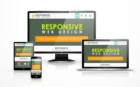
The Importance of Responsive Web Design
In today’s digital age, where the majority of internet users access websites through various devices such as smartphones, tablets, and laptops, having a responsive web design is crucial for businesses and individuals alike.
A responsive web page is one that adapts and adjusts its layout and content based on the screen size and device being used to access it. This ensures that the user experience remains seamless and consistent across all platforms, leading to higher engagement and satisfaction.
Here are some key reasons why responsive web design is essential:
Improved User Experience
By providing a responsive design, users can easily navigate your website regardless of the device they are using. This leads to a positive user experience, encouraging visitors to stay longer on your site and explore its content.
Increased Mobile Traffic
With the rise of mobile devices, more and more people are browsing the internet on their smartphones. A responsive web design ensures that your website looks great and functions well on mobile devices, capturing a larger share of mobile traffic.
Higher SEO Ranking
Search engines like Google favour responsive websites because they provide a better user experience. Having a responsive design can positively impact your search engine ranking, making it easier for potential customers to find your site online.
Cost-Effective Solution
Instead of creating separate websites for different devices, investing in a responsive web design is a cost-effective solution in the long run. It eliminates the need for multiple versions of your site and reduces maintenance efforts.
Future-Proofing Your Website
A responsive web design ensures that your website is ready for future technological advancements and new devices. It allows your site to adapt seamlessly to upcoming changes in screen sizes and resolutions without requiring major redesigns.
In conclusion, having a responsive web page is no longer just an option but a necessity in today’s digital landscape. It not only enhances user experience but also boosts visibility, accessibility, and overall success of your online presence.
Understanding Responsive Web Design: Answers to Common Questions
- What is meant by responsive web page?
- How to see responsive web in Chrome?
- Is it difficult to make a website responsive?
- How can a website be responsive?
- How to check if a website is responsive?
- What is the difference between responsive and adaptive website?
- Which is an example of a responsive web page?
- What is an example of a responsive website?
What is meant by responsive web page?
A responsive web page refers to a design approach that ensures a website can adapt and adjust its layout, content, and functionality based on the device being used to access it. In essence, a responsive web page dynamically responds to the screen size, orientation, and platform of the user, providing an optimal viewing experience across various devices such as smartphones, tablets, laptops, and desktop computers. This adaptability allows users to navigate and interact with the website seamlessly, regardless of the device they are using, ultimately enhancing user experience and engagement.
How to see responsive web in Chrome?
To view a responsive web page in Chrome, you can easily simulate different device sizes by using the built-in Developer Tools feature. Simply right-click on the webpage, select “Inspect,” and then click on the “Toggle Device Toolbar” icon in the top-left corner of the Developer Tools panel. This will allow you to choose from a variety of preset device sizes or customize your own to see how the webpage responds and adapts to different screen dimensions. By utilising this tool, you can effectively test and optimise your website for various devices, ensuring a seamless and user-friendly experience across all platforms.
Is it difficult to make a website responsive?
Creating a responsive website can be perceived as challenging for those who are unfamiliar with web design and development. However, with the right knowledge, tools, and techniques, making a website responsive is achievable. It involves using CSS media queries to adjust the layout and styling based on different screen sizes. While there may be complexities in ensuring consistent functionality across various devices, the benefits of having a responsive website far outweigh the initial learning curve. Working with experienced web designers and developers can streamline the process and help ensure a seamless transition to a responsive design that enhances user experience and boosts online visibility.
How can a website be responsive?
Creating a responsive website involves implementing design and development techniques that allow the site to adapt to different screen sizes and devices. This can be achieved through using flexible grids and layouts, employing media queries to adjust styles based on screen characteristics, optimizing images for various resolutions, and ensuring touch-friendly navigation. By incorporating these elements into the website’s design and code, developers can ensure that the site responds effectively to users’ devices, providing a seamless and user-friendly experience across all platforms.
How to check if a website is responsive?
To determine if a website is responsive, there are several simple methods you can use. One common approach is to manually resize your browser window and observe how the website layout adjusts to different screen sizes. Additionally, you can visit the website on various devices such as smartphones, tablets, and desktop computers to see how it appears and functions across different platforms. Another useful tool is Google’s Mobile-Friendly Test, which analyses a website’s responsiveness and provides insights on areas that may need improvement. By employing these techniques, you can easily assess whether a website is truly responsive and optimised for diverse viewing experiences.
What is the difference between responsive and adaptive website?
When discussing the difference between responsive and adaptive websites, it’s important to note that both approaches aim to enhance user experience across various devices. Responsive web design uses fluid grids and flexible layouts to automatically adjust content based on screen size, providing a seamless viewing experience. On the other hand, adaptive web design involves creating multiple fixed layout sizes designed for specific screen sizes, detecting the device’s screen size and loading the appropriate layout. While responsive design offers a more fluid and dynamic approach to adaptability, adaptive design provides more control over how content is displayed on different devices. Ultimately, the choice between responsive and adaptive design depends on factors such as project requirements, target audience, and budget considerations.
Which is an example of a responsive web page?
An excellent example of a responsive web page is the official website of Starbucks. When you visit the Starbucks website on different devices such as a desktop computer, tablet, or smartphone, you will notice how the layout and content adjust seamlessly to fit the screen size. This ensures that users have a consistent and user-friendly experience regardless of the device they are using to access the site. The responsive design of the Starbucks website showcases how a well-executed responsive web page can enhance user engagement and accessibility across various platforms.
What is an example of a responsive website?
An excellent example of a responsive website is the official website of Starbucks. When you visit Starbucks’ website on different devices, such as a desktop computer, a tablet, or a smartphone, you will notice how the layout and content adjust seamlessly to fit the screen size. The responsive design ensures that users have a consistent and user-friendly experience regardless of the device they are using to access the website. This adaptability not only enhances user engagement but also reflects Starbucks’ commitment to providing a modern and accessible online experience for its customers.