
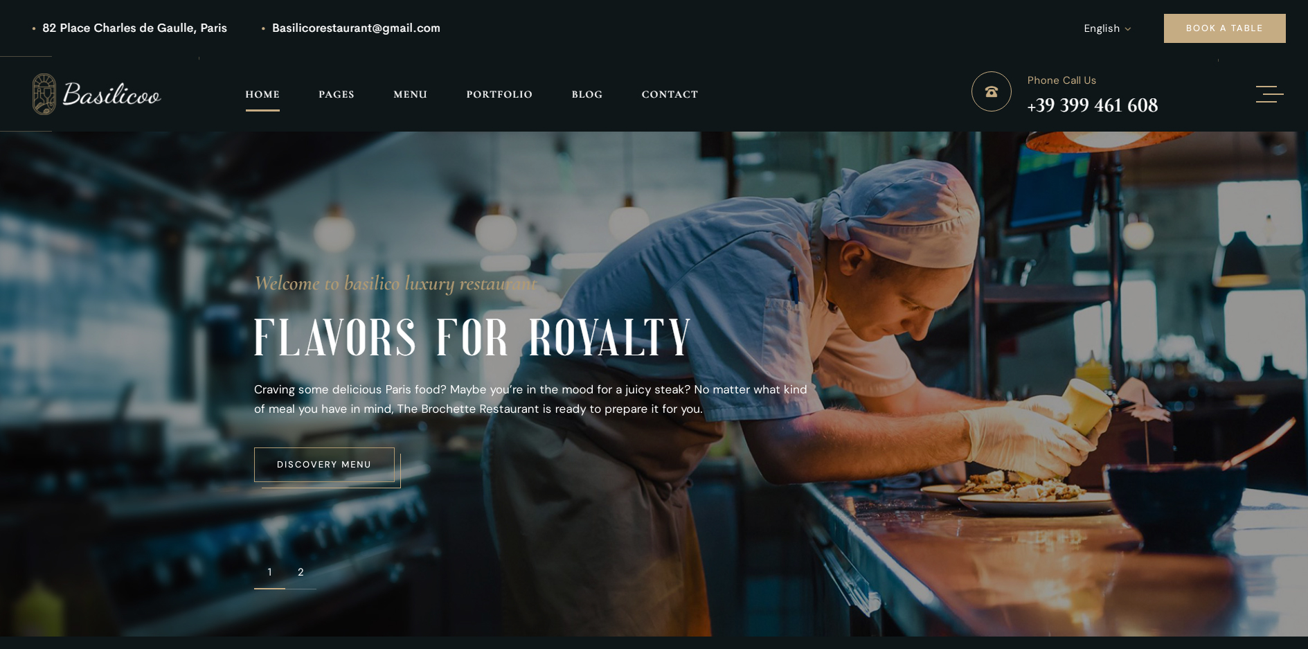
Restaurant Website Design: A Guide to Creating a Website That Brings in Customers
A restaurant’s website is often the first place potential customers go to check the menu, explore the atmosphere and decide whether to book a table. A well-designed site makes that decision easier. It should look appealing, work smoothly on mobile phones and provide the information visitors need without making them search for it.
Whether you run a café, takeaway, neighbourhood restaurant or fine-dining venue, thoughtful website design can help turn online visitors into diners.
Make a strong first impression
Visitors form an impression of a restaurant quickly. Use a clear layout, consistent branding and high-quality images to show what makes your venue distinctive. Professional photographs of your dishes, dining area and team can help people imagine the experience before they arrive.
Keep the design in step with the restaurant itself. A relaxed café might use warm colours and informal photography, while a modern restaurant may suit a more refined, minimal style. The aim is not simply to look attractive, but to communicate the character of the place.
Put essential information within easy reach
People often visit restaurant websites with a specific question in mind. Make the answers easy to find, particularly on mobile. Important details include:
- Opening hours and location
- Menus and prices
- Booking or ordering options
- Contact details
- Information about dietary requirements and allergens
- Parking, accessibility and public transport details
Use straightforward navigation and descriptive labels such as “Menu”, “Book a table” and “Find us”. Avoid hiding key information behind several layers of menus.
Design for mobile first
Many customers browse restaurant websites on their phones, often while deciding where to eat or when they are already out. A responsive website adjusts to different screen sizes, making text readable and buttons easy to tap.
Check that the menu is legible without excessive zooming, phone numbers can be tapped to call, and booking links are prominent. Images should load quickly and should not push essential details too far down the page.
Make booking and ordering simple
Every extra step can make a visitor less likely to complete a booking or order. Place a clear call to action near the top of the homepage and repeat it where it is useful. If customers can book online, make the process quick and explain what happens after they submit a reservation.
For takeaway and delivery, show the ordering options clearly, including delivery areas, collection arrangements and any relevant minimum spend. Test the journey from start to finish on both a phone and a computer.
Present the menu thoughtfully
The menu is one of the most visited parts of a restaurant website. Make it easy to browse and keep it up to date. A mobile-friendly webpage is generally easier to read than a scanned image or a downloadable file that visitors have to open separately.
Use clear dish names and descriptions, and display prices consistently. Where relevant, include dietary information and explain how customers can ask about allergens. Never rely on icons alone if a short text explanation would make the information clearer.
Use images with care
Food photography can make a restaurant’s website more inviting, but images should represent the real experience. Choose well-lit, high-quality photographs that reflect the dishes and setting customers will encounter in person.
Large image files can slow down a website, so optimise them for the web. Add concise alternative text to meaningful images so that people using screen readers can understand what they show.
Build trust with accurate details
Consistency matters. Make sure the address, telephone number and opening hours on the website match the details shown on your social media profiles and business listings. If opening times change for holidays or special events, update them promptly.
Customer reviews, awards and testimonials can help build confidence when they are genuine and presented with permission. Useful information about the restaurant’s story, ingredients or approach to hospitality can also help visitors understand what sets it apart.
Improve speed, accessibility and search visibility
A good restaurant website should be fast, accessible and easy for search engines to understand. Use readable text, sufficient colour contrast, descriptive page titles and a clear heading structure. Make sure the site can be navigated using a keyboard and that forms have clear labels.
Local search visibility is especially valuable for restaurants. Include the venue’s location naturally in relevant page content, and provide accurate business details. A well-maintained website can support local discovery, but avoid awkwardly repeating keywords or making claims that the business cannot verify.
Keep the website up to date
A restaurant’s website needs ongoing attention. Review menus, prices, opening hours and booking links regularly. Remove outdated promotions and check that every important page works correctly. A simple content management system can make routine updates easier for restaurant staff.
Conclusion
Effective restaurant website design combines attractive visuals with practical information and straightforward actions. By focusing on mobile usability, clear menus, easy bookings and accurate details, restaurants can create a helpful online experience that encourages customers to visit, book or order.
9 Essential Tips for Designing an Effective Restaurant Website
- Make menus easy to find and read.
- Use high-quality photos of your food.
- Show opening hours and location clearly.
- Make booking quick and simple.
- Design for mobile screens first.
- Keep page layouts clean and uncluttered.
- Use clear labels for dietary options.
- Display contact details on every page.
- Check that text has strong colour contrast.
Make menus easy to find and read.
Make your menu easy to find from every key page, with a clearly labelled link such as “View menu”. Present it as readable text rather than a small image or hard-to-open PDF, so customers can browse comfortably on mobile or desktop. Use clear dish names, helpful descriptions and visible prices, and keep the menu up to date. Where relevant, include dietary information and explain how guests can ask about allergens.
Use high-quality photos of your food.
Use high-quality photos of your food to help visitors imagine the dishes and get a feel for your restaurant before they arrive. Choose clear, well-lit images that show your meals at their best and reflect what customers can expect when they order. Keep photos authentic, optimise file sizes so they load quickly, and add descriptive alternative text to make them more accessible.
Show opening hours and location clearly.
Make your opening hours and location easy to find, especially on mobile. Display your current hours in a clear, prominent place, and include your full address alongside a map or directions link. This helps customers quickly plan their visit and avoids confusion if your hours change for holidays or special events.
Make booking quick and simple.
Make booking quick and simple by placing a clear “Book a table” button where visitors can find it easily, especially on mobile. Keep the form short, ask only for essential details and make available dates and times straightforward to choose. Confirm the reservation promptly, and clearly explain what happens next. The fewer steps customers need to take, the more likely they are to complete their booking.
Design for mobile screens first.
Design your restaurant website for mobile screens first, as many customers will browse on their phones while deciding where to eat or making plans on the go. Keep text easy to read, menus simple to navigate and buttons—such as “Book a table” or “Order now”—large enough to tap comfortably. Make sure key details, including opening hours, location and contact information, are quick to find, and optimise images so pages load quickly even on mobile data.
Keep page layouts clean and uncluttered.
Keep page layouts clean and uncluttered so visitors can quickly find what they need, whether they’re checking the menu, booking a table or looking for your opening hours. Use clear headings, plenty of white space and simple navigation, and avoid filling pages with too many images, pop-ups or competing calls to action. A well-organised design feels welcoming, works especially well on mobile and keeps the focus on your food and restaurant.
Use clear labels for dietary options.
Use clear, consistent labels to help diners quickly identify dietary options on your menu. Mark vegetarian, vegan, gluten-free and other suitable dishes with simple text or familiar symbols, and include a brief key so everyone understands what each label means. Be careful not to imply that a dish is suitable for someone with an allergy unless you can confirm how it is prepared; provide clear allergen information and explain how customers can ask your team for details.
Display contact details on every page.
Display your contact details on every page so visitors can quickly get in touch, wherever they are on your website. Include your telephone number, address and a clear link to your contact page, and make phone numbers clickable on mobile devices. This makes it easier for customers to ask a question, find your restaurant or make a booking without having to search for your details.
Check that text has strong colour contrast.
Check that text has strong colour contrast against its background so that menus, prices and booking details are easy to read. Good contrast helps all visitors, including people with low vision or colour-vision deficiencies, and improves readability on mobile screens and in bright light. Avoid placing text over busy images, and test colour combinations with an accessibility contrast checker.