
The Art of Web and Mobile Design
Web and mobile design play a crucial role in shaping the digital experiences we encounter every day. From browsing a website on your laptop to scrolling through an app on your smartphone, design elements influence how we interact with technology.
Web Design
Web design encompasses the visual aesthetics and user experience of websites. A well-designed website not only looks appealing but also functions seamlessly, guiding users through content effortlessly. Key aspects of web design include layout, colour scheme, typography, and navigation.
Responsive web design is essential in today’s mobile-centric world. Websites must adapt to different screen sizes and devices to provide a consistent user experience across platforms. Utilising responsive design techniques ensures that content remains accessible and visually pleasing on desktops, tablets, and smartphones.
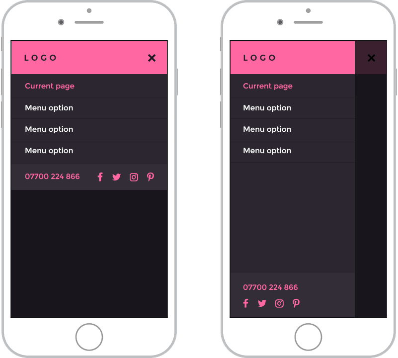
Mobile Design
Mobile design focuses on creating engaging experiences for users on smartphones and tablets. With the increasing use of mobile devices for browsing the internet and accessing apps, designing for mobile has become paramount. Mobile design considerations include touch-friendly interfaces, simplified navigation, and optimised performance.
Mobile-first design is a strategy that prioritises designing for mobile devices before scaling up to larger screens. By starting with the constraints of mobile platforms, designers can create streamlined experiences that work efficiently across all devices.
The Intersection of Web and Mobile Design
As technology evolves, the boundaries between web and mobile design continue to blur. Many websites now incorporate responsive elements that mimic app-like interactions on mobile devices. Progressive web apps (PWAs) combine the best of both worlds by offering fast-loading web experiences with the capabilities of native mobile apps.
Designers must consider the unique characteristics of both web and mobile platforms to create cohesive digital experiences that resonate with users. Consistent branding, intuitive navigation, and engaging visuals are essential elements that bridge the gap between web and mobile design.
In Conclusion
Web and mobile design are integral components of modern digital experiences. By focusing on user-centric principles, embracing responsive techniques, and adapting to evolving technologies, designers can craft compelling websites and apps that captivate audiences across all devices.
Essential FAQs on Enhancing Web and Mobile Design: Responsiveness, UX, and Accessibility
- What is the importance of responsive design in web and mobile design?
- How can user experience (UX) principles enhance web and mobile design?
- What are the key differences between designing for web and designing for mobile?
- Why is it crucial to consider loading times in web and mobile design?
- What role does typography play in creating effective web and mobile designs?
- How can designers ensure accessibility and inclusivity in web and mobile design?
What is the importance of responsive design in web and mobile design?
Responsive design is crucial in both web and mobile design due to its ability to adapt and provide an optimal user experience across various devices and screen sizes. With the increasing use of smartphones and tablets for browsing the internet, ensuring that websites and applications are responsive has become essential. Responsive design not only improves accessibility but also enhances user engagement by delivering content in a visually appealing and easy-to-navigate manner. By prioritising responsiveness, designers can cater to a diverse audience and maintain consistency in branding and functionality, ultimately enhancing the overall effectiveness of digital experiences.
How can user experience (UX) principles enhance web and mobile design?
User experience (UX) principles play a pivotal role in elevating both web and mobile design by focusing on creating intuitive, engaging, and user-friendly interfaces. By incorporating UX principles such as usability, accessibility, and user research, designers can ensure that websites and mobile apps are tailored to meet the needs and expectations of their target audience. Emphasising clear navigation, responsive layouts, intuitive interactions, and consistent branding not only enhances the overall user experience but also fosters user satisfaction and loyalty. Ultimately, integrating UX principles into web and mobile design leads to more effective digital solutions that resonate with users and drive success for businesses in the competitive online landscape.
What are the key differences between designing for web and designing for mobile?
When considering the key differences between designing for web and designing for mobile, several crucial factors come into play. Web design typically involves creating layouts that cater to larger screens, allowing for more intricate navigation structures and content display. In contrast, mobile design requires a focus on streamlined interfaces, touch-friendly interactions, and optimised performance for smaller screens. Designers must adapt their approach to accommodate varying user behaviours and device capabilities, ensuring that websites and mobile apps deliver a seamless user experience across different platforms. By understanding these distinctions and tailoring design elements accordingly, designers can effectively meet the unique requirements of web and mobile environments.
Why is it crucial to consider loading times in web and mobile design?
In the realm of web and mobile design, the consideration of loading times holds immense significance. The speed at which a website or mobile app loads directly impacts user experience and engagement. In today’s fast-paced digital landscape, users expect instant access to content and seamless interactions. Slow loading times can lead to frustration, increased bounce rates, and ultimately, loss of potential customers. By prioritising loading times in design decisions, designers can enhance performance, improve usability, and create a positive user experience that keeps visitors coming back for more.
What role does typography play in creating effective web and mobile designs?
Typography plays a pivotal role in creating effective web and mobile designs by influencing readability, visual hierarchy, and overall user experience. The choice of fonts, font sizes, spacing, and alignment directly impact how content is perceived and navigated by users. Well-crafted typography enhances the clarity of information, guides users through the interface, and conveys the tone and personality of a brand. By paying attention to typography in design, designers can elevate the aesthetics and functionality of websites and mobile apps, ensuring that content is not only visually appealing but also easy to consume across different devices.
How can designers ensure accessibility and inclusivity in web and mobile design?
Ensuring accessibility and inclusivity in web and mobile design is paramount for designers seeking to create user-friendly experiences for all individuals. Designers can achieve this by adhering to web content accessibility guidelines (WCAG) to make their designs perceivable, operable, understandable, and robust for users with diverse abilities. Incorporating features such as alt text for images, proper heading structures, colour-contrast ratios, keyboard navigation options, and clear call-to-action buttons can enhance accessibility. Additionally, conducting usability testing with individuals representing different demographics can provide valuable feedback to improve inclusivity in design practices. By prioritising accessibility and inclusivity from the outset of a project, designers can ensure that their web and mobile designs are welcoming and usable for everyone.