
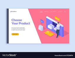
Online Banner Design: How to Create Banners That Get Noticed
Online banners are a familiar part of the digital landscape, appearing on websites, social media platforms and search results. A well-designed banner can catch someone’s attention, communicate an offer and encourage them to take action. A poorly designed one, however, may be overlooked or ignored.
Effective online banner design is about more than attractive graphics. It combines clear messaging, thoughtful layout and a strong understanding of the audience. Whether you are promoting a product, sharing an event or building brand awareness, these principles can help your banner make a lasting impression.
Start with a clear objective
Before choosing colours or images, decide what the banner needs to achieve. Is the aim to increase sales, attract visitors to a website, generate enquiries or raise awareness of a campaign? A clear objective makes it easier to decide what information to include and what action you want people to take.
Try to keep each banner focused on one main message. Including several offers, benefits and calls to action can make the design feel crowded and leave viewers unsure about what to do next.
Know your audience
A banner should be designed for the people you want to reach. Consider their interests, needs and familiarity with your product or service. The design, language and imagery should feel relevant to them and reflect the expectations of the platform where the banner will appear.
For example, a banner promoting a professional service may benefit from a clean, restrained design, while a campaign aimed at a younger audience might use brighter colours and a more energetic tone. The right approach depends on the brand and its audience.
Make the message easy to read
Online banners are often viewed quickly, sometimes on a small mobile screen. Keep the wording concise and make the most important information immediately visible. A strong headline can communicate the main benefit, while supporting text can provide a little more context.
Choose fonts that are easy to read and use a clear hierarchy. The headline should usually be more prominent than the supporting copy, with the call to action easy to spot. Avoid using too many typefaces or squeezing in long blocks of text.
Use colour and imagery with purpose
Colour can help a banner stand out, express a particular mood and reinforce brand identity. Use a considered palette and make sure there is enough contrast between the text and background. If the colours are too similar, key information may be difficult to read.
Images should support the message rather than compete with it. Choose high-quality visuals that are relevant to the offer and appropriate for your brand. If you use product photography, make sure the product is easy to recognise. If you use illustrations or lifestyle imagery, keep the overall composition uncluttered.
Give your call to action prominence
A call to action (CTA) tells viewers what to do next. Examples include “Shop now”, “Find out more” or “Book a consultation”. Use direct, concise wording and make the CTA visually distinct, perhaps with a button or contrasting colour.
Make sure the action matches the destination. If the banner says “Explore the collection”, the link should take people directly to the relevant collection rather than to a general homepage.
Design for different sizes and devices
Online banners appear in many formats, and a design that works well on a desktop may not translate neatly to a mobile screen. Important text or imagery can be cropped, become too small or lose its impact when resized.
Check the specifications for each placement before you begin, then create versions suited to the required dimensions. Keep essential content away from the edges and test how the banner looks on both mobile and desktop screens. Where possible, use responsive formats that adapt to different screen sizes.
Keep your branding consistent
Consistent branding helps people recognise your business and builds familiarity over time. Use your established colours, logo and visual style, while allowing enough flexibility for the banner to suit the campaign.
Place the logo where it can be seen without overpowering the message. If the brand is unfamiliar to the audience, make sure the banner still explains what is being offered rather than relying on the logo alone.
Consider accessibility
Accessible design helps make your banner easier for more people to understand. Use readable text, strong colour contrast and clear wording. Avoid relying on colour alone to communicate important information, and make sure any linked content is accessible as well.
If the banner is animated, keep the movement subtle and avoid rapid flashing. Animation should support the message, not distract from it.
Test and improve
There is no single banner design that works for every audience or campaign. Testing different headlines, images, colours or calls to action can show which version performs better. Use the results to guide future designs, rather than relying solely on personal preference.
It is also worth checking practical details before launch: spelling, links, image quality, file size and how the banner appears in its final placement. Small errors can undermine an otherwise polished design.
Bring your banner together
Successful online banner design balances visual appeal with clarity and purpose. Start with a focused objective, understand your audience and make the message easy to grasp at a glance. With thoughtful use of typography, colour, imagery and a clear call to action, your banner can help turn attention into meaningful engagement.
Online Banner Design: 9 Frequently Asked Questions
- What is online banner design?
- What are the standard sizes for online banners?
- How do I design an effective online banner?
- Which file format should I use for an online banner?
- How much text should an online banner include?
- What makes a good call to action on a banner?
- How can I make sure my banner looks good on mobile devices?
- How do I choose colours and images for an online banner?
- How can I measure the performance of an online banner?
What is online banner design?
Online banner design is the process of creating visual advertisements for websites, social media platforms and other digital channels. A banner typically combines images, text and brand elements to promote a product, service, event or offer. Effective design makes the message easy to understand at a glance and includes a clear call to action, while adapting to the size and format of the placement.
What are the standard sizes for online banners?
Standard online banner sizes vary by platform and placement, so it’s best to check the publisher’s specifications before designing. Common IAB display sizes include the medium rectangle (300 × 250 px), leaderboard (728 × 90 px), wide skyscraper (160 × 600 px) and mobile banner (320 × 50 px). Social media platforms and advertising networks may also require their own dimensions, file formats and size limits. For the best results, prepare versions for each placement and check how they appear on both desktop and mobile screens.
How do I design an effective online banner?
To design an effective online banner, start with one clear objective and focus on a single, concise message. Use strong visual hierarchy so the headline and key benefit are easy to spot, choose high-quality imagery and colours that reflect your brand, and ensure the text is readable with good contrast. Add a prominent call to action, such as “Shop now” or “Find out more”, and make sure the banner is designed for the sizes and devices where it will appear. Before publishing, check that the design looks clear on both mobile and desktop, and test different versions to see which performs best.
Which file format should I use for an online banner?
The best file format depends on where your banner will appear and whether it needs animation. Use JPEG for photographic images, PNG for graphics that need a transparent background, and WebP where it is supported for smaller file sizes with good image quality. For simple animation, GIF may be suitable, although it can look less crisp and create larger files. Always check the platform’s requirements, optimise the file for fast loading, and use an HTML5 banner if you need richer animation or interactive elements.
How much text should an online banner include?
An online banner should include only enough text to communicate its main message and encourage the viewer to take action. Keep the headline short, add a brief supporting detail if needed, and use a clear call to action such as “Shop now” or “Find out more”. As banners are often viewed quickly and on small screens, concise wording and readable text are more effective than trying to include every detail.
What makes a good call to action on a banner?
A good call to action (CTA) is clear, concise and tells people exactly what to do next. Use direct, action-focused wording such as “Shop now”, “Book a consultation” or “Find out more”, and make the CTA easy to spot with strong contrast and a button or other clear visual treatment. Keep it relevant to the banner’s message, and ensure the link takes people to the page they expect.
How can I make sure my banner looks good on mobile devices?
To make sure your banner looks good on mobile devices, design it for smaller screens from the start rather than simply shrinking a desktop version. Keep the message concise, use large, legible text and strong colour contrast, and make the call to action easy to tap. Place important content away from the edges, where it could be cropped, and use appropriately sized, high-quality images. Check the banner at different screen sizes and orientations before publishing, and create separate versions if the design needs to suit different placements.
How do I choose colours and images for an online banner?
Choose colours that reflect your brand and create strong contrast between the text and background, so the message is easy to read at a glance. Use a small, consistent colour palette rather than too many competing shades. Select high-quality images that are relevant to your offer and audience, and make sure they support the message instead of distracting from it. Before publishing, check that the design looks clear on both mobile and desktop screens.
How can I measure the performance of an online banner?
Measure an online banner’s performance against its goal using relevant analytics. Track impressions to see how often it was displayed, and clicks and click-through rate (CTR) to understand whether it attracted attention. If the aim is to generate sales, enquiries or sign-ups, monitor conversions and conversion rate as well. Use campaign tracking links, such as UTM parameters, to identify traffic and results from each banner. Comparing different designs or messages through A/B testing can reveal what works best. Consider the banner’s placement, audience and campaign period when reviewing results, as these factors can also affect performance.