
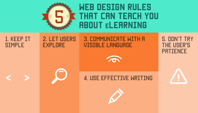
Simple Web Design: Less Clutter, More Clarity
Simple web design is not about making a website look plain or removing everything that gives it character. It is about making each element useful, easy to understand and straightforward to use. When visitors can quickly find what they need, they are more likely to enjoy their experience and take the next step.
Start with a clear purpose
Before choosing colours or arranging images, decide what the website needs to achieve. Is it there to introduce a business, showcase a portfolio, share information or sell products? A clear purpose helps guide every design decision, from the words on the homepage to the placement of its buttons.
Each page should also have a main goal. When too many messages compete for attention, visitors may struggle to know where to look or what to do. Focus on the most important information first, then add supporting details where they are genuinely helpful.
Make navigation easy
Good navigation helps visitors move around a website without having to think too hard. Use familiar labels such as “About”, “Services” and “Contact”, and keep the menu concise. If a website has many pages, group related links into clear sections.
Visitors should be able to tell where they are and how to get back to other key pages. A consistent menu, clear page headings and useful links all help create a smoother experience.
Use space to create focus
White space—the empty space around text and other elements—is an important part of simple web design. It gives content room to breathe, makes pages easier to scan and helps draw attention to the most important details. A page does not need to fill every available space to feel complete.
Use headings, short paragraphs and lists to organise information. This makes content easier to read, particularly for people browsing on a small screen or looking for a specific answer.
Choose a considered colour and type palette
A small, consistent colour palette can make a website feel polished and cohesive. Choose colours that suit the brand and use them purposefully—for example, to distinguish headings, highlight links or draw attention to a call to action.
Typography matters just as much. Choose legible typefaces, use a comfortable text size and provide enough contrast between the text and its background. Decorative fonts can work well in small doses, but body text should be easy to read.
Design for every screen
People visit websites on phones, tablets and desktop computers, so a simple design should work well at different screen sizes. Responsive layouts adjust to the available space, keeping text readable and controls easy to use.
Check that buttons are large enough to tap, menus work on mobile devices and important information does not disappear on smaller screens. A design that looks good only on a desktop is not truly simple for everyone.
Keep accessibility in mind
An accessible website is easier for more people to use. Write descriptive link text, add alternative text to meaningful images and organise pages with properly structured headings. Make sure visitors can navigate using a keyboard, and avoid relying on colour alone to communicate important information.
Accessibility is not an extra layer to add at the end. It is part of making a website clear and usable from the start.
Keep pages fast and focused
Large images, unnecessary animations and excessive features can slow a website down and distract from its content. Use appropriately sized images and include only the functions visitors need. A faster, more focused page is often easier to use—and more pleasant to browse.
Simple design is thoughtful design
The best simple websites make their purpose clear, guide visitors naturally and present information in an organised way. Achieving that simplicity takes careful choices: removing distractions, refining content and making sure every element has a reason to be there.
Start with the needs of your visitors, keep the experience consistent and test the website on different devices. With a clear purpose and a few well-considered design decisions, a simple website can make a lasting impression.
6 Simple Tips for Clean, Accessible Web Design
- Keep layouts clean and uncluttered.
- Use readable fonts and clear headings.
- Choose a simple, consistent colour palette.
- Make navigation easy to find.
- Design for mobile screens first.
- Check contrast and accessibility.
Keep layouts clean and uncluttered.
Keep layouts clean and uncluttered so visitors can focus on what matters. Use plenty of white space, organise content with clear headings and avoid adding elements that do not serve a purpose. A tidy layout is easier to scan, works better across different screen sizes and helps people find the information they need.
Use readable fonts and clear headings.
Use readable fonts and clear headings to make your website easy to scan and understand. Choose a simple typeface with comfortable sizing and good contrast against the background, then organise content with descriptive headings that show what each section covers. A clear visual hierarchy helps visitors find the information they need, whether they are reading on a desktop or a mobile device.
Choose a simple, consistent colour palette.
Choose a simple, consistent colour palette to give your website a clear and cohesive look. A few well-matched colours are usually enough: use one or two as your main colours, then reserve a contrasting shade for important details such as links and buttons. Keep text easy to read by ensuring strong contrast with the background, and apply your colours consistently across every page. This helps visitors focus on the content and recognise your brand.
Make navigation easy to find.
Make navigation easy to find by placing it where visitors expect it, such as across the top of the page or behind a clearly labelled menu button on mobile. Use short, familiar labels like “About”, “Services” and “Contact”, and keep the number of options manageable. Clear, consistent navigation helps people find what they need quickly and move around your website with confidence.
Design for mobile screens first.
Designing for mobile screens first helps ensure your website works well where many people browse: on their phones. Start with the essentials, such as clear headings, concise content, easy-to-tap buttons and simple navigation. Then adapt the layout for larger screens, adding space or extra detail where it improves the experience. This approach keeps your website focused, readable and easy to use on any device.
Check contrast and accessibility.
Check that text stands out clearly from its background so it is easy to read, including for people with visual impairments. Don’t rely on colour alone to communicate important information; combine it with labels, icons or other visual cues. Clear focus indicators, descriptive links and text alternatives for meaningful images also make your website easier for more people to use.