
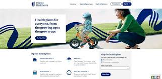
Web Design Examples: Ideas for Creating a Better Website
Looking at web design examples is a useful way to discover what works, find inspiration and clarify what you want from a new website. The best designs are not simply attractive: they make information easy to find, guide visitors towards useful actions and work smoothly on every screen.
Below are several types of website design, with examples of approaches you can adapt to your own business or project.
Minimalist business website
A minimalist website uses clear typography, generous white space and a restrained colour palette. It avoids unnecessary decoration so visitors can focus on the message.
For example, a consultancy might have a simple homepage with a concise headline, a short explanation of its services and a prominent “Book a consultation” button. A small number of well-organised pages can make the business feel confident and approachable.
Works well for: consultancies, professional services, studios and businesses with a focused offer.
E-commerce website with clear product pages
A successful online shop makes it easy to browse products, understand the details and complete a purchase. Strong product photography, clear pricing and visible delivery information all help customers make informed decisions.
Imagine a clothing shop with simple category navigation, filters for size and colour, and product pages that include several images, a size guide and customer reviews. A clear checkout process should show each step and avoid asking for unnecessary information.
Works well for: retailers, makers and brands selling products online.
Portfolio website focused on the work
For creative professionals, the work should take centre stage. A portfolio design might use a grid of project images, with each project opening into a page that explains the brief, process and result.
A photographer, for instance, could organise projects by subject, such as portraits, events and commercial work. A short introduction and easy-to-find contact details help visitors understand the photographer’s style and make an enquiry.
Works well for: designers, photographers, illustrators, architects and agencies.
Service website with a step-by-step journey
When visitors need to understand how a service works, a structured layout can make the decision easier. The homepage can introduce the service, explain who it is for, outline the process and answer common questions.
A home renovation company might present its journey in three steps: arrange a consultation, receive a proposal and begin the project. Testimonials and examples of previous work can provide further reassurance.
Works well for: tradespeople, agencies, healthcare providers and other service businesses.
Editorial website designed for reading
Blogs, magazines and news sites need to make articles comfortable to read and simple to explore. A good editorial design uses legible fonts, clear headings, a sensible line length and consistent spacing.
For example, a food publication could feature a prominent story at the top of the homepage, followed by categories such as recipes, kitchen advice and interviews. Related articles at the end of each post encourage readers to continue browsing.
Works well for: publishers, bloggers, community organisations and content-led businesses.
Landing page with one clear goal
A landing page is designed around a specific action, such as signing up, downloading a guide or requesting a quote. Its content should support that goal rather than compete with it.
A software company promoting a free trial might use a direct headline, a short list of benefits, a product image and a prominent sign-up form. Frequently asked questions can address common concerns without distracting from the main action.
Works well for: campaigns, product launches, events and lead generation.
Website with a strong local identity
Local businesses can use design to communicate a sense of place. This might include photographs of the area, references to nearby communities and practical information such as opening hours, directions and service locations.
A neighbourhood café could feature its menu, location and booking details near the top of the page, alongside photography that reflects the atmosphere of the café. Keeping essential information easy to find is especially helpful for visitors using a mobile phone.
Works well for: cafés, shops, venues, local services and tourism businesses.
What makes these web design examples effective?
Although these examples serve different purposes, the strongest websites tend to share a few important qualities:
- Clear purpose: Visitors can quickly understand what the website offers.
- Simple navigation: Important pages are easy to find.
- Readable content: Text is well structured and easy to scan.
- Consistent design: Colours, typography and buttons feel connected across the site.
- Responsive layouts: Pages work well on mobiles, tablets and desktop computers.
- Useful calls to action: Visitors know what to do next.
- Accessibility: Good contrast, descriptive links and image text alternatives help more people use the site.
How to use web design examples for inspiration
When reviewing examples, look beyond colours and visual trends. Ask what the website is trying to achieve, who it is designed for and how its layout helps visitors reach their goals. Notice how it presents information, handles mobile screens and builds trust.
It is usually better to borrow principles than to copy a design outright. A layout that works for a large online retailer may not suit a small professional services firm. Use examples to identify ideas, then adapt them to your audience, content and brand.
Conclusion
Web design examples can help you plan a website that looks polished and works effectively. Whether you are building an online shop, a portfolio, a service website or a landing page, prioritise clarity, usability and a strong mobile experience. A thoughtful design makes it easier for visitors to find what they need—and easier for your business to achieve its goals.
9 Tips for Learning from Web Design Examples
- Study examples from a range of industries.
- Notice how each example guides the eye.
- Compare layouts on mobile and desktop.
- Look for clear, consistent navigation.
- Check how colour supports the brand.
- Observe how images fit the content.
- Learn from concise, readable typography.
- Note how examples use white space.
- Adapt ideas rather than copying designs.
Study examples from a range of industries.
Study web design examples from a range of industries, not just those similar to your own. A retailer’s clear product filters, a charity’s compelling storytelling or a restaurant’s easy-to-find booking details could all inspire useful ideas for your website. Look at how each design serves its audience, then adapt the principles that suit your goals, brand and visitors rather than copying the style outright.
Notice how each example guides the eye.
Notice how each example guides the eye around the page. Look at the placement of headings, images, colours and buttons, and consider what visitors are likely to see first and where they are encouraged to go next. A clear visual hierarchy helps people find important information quickly and understand the action they can take.
Compare layouts on mobile and desktop.
Compare how each web design example works on mobile and desktop, rather than judging it by its desktop appearance alone. Check whether the navigation is easy to use, text remains readable, images display well and important buttons are easy to tap on a smaller screen. A design that adapts smoothly across devices offers a more consistent experience and helps visitors find what they need wherever they are browsing.
Look for clear, consistent navigation.
When reviewing web design examples, look for clear, consistent navigation that helps visitors understand where they are and how to find what they need. Menus should use familiar labels, follow the same structure across pages and work smoothly on mobile devices. A well-designed navigation system reduces frustration and makes it easier for people to explore your website and take the next step.
Check how colour supports the brand.
Check how colour supports the brand by looking at whether the website’s palette reflects its personality and appeals to its intended audience. Colours should feel consistent with the brand across backgrounds, text, buttons and links, while providing enough contrast to keep content readable. A well-chosen palette helps create recognition and guide visitors’ attention without overwhelming the page.
Observe how images fit the content.
Observe how images fit the content in strong web design examples. Images should support the message, add useful context and feel consistent with the site’s style—not distract from the text or slow the page down. Consider their size, placement, quality and how they adapt to mobile screens, and use descriptive alt text to make them more accessible.
Learn from concise, readable typography.
Learn from web design examples that use concise, readable typography to make every page easier to navigate. Clear font choices, comfortable text sizes, good contrast and generous line spacing help visitors scan content and focus on what matters. Use headings to create a logical structure, keep paragraphs short and reserve decorative type for limited accents. Typography should reflect your brand while remaining legible on mobile screens and accessible to a wide range of readers.
Note how examples use white space.
Notice how web design examples use white space—the empty areas around text, images and other elements. Used well, it gives a page room to breathe, makes content easier to scan and draws attention to important details such as headings or buttons. Rather than filling every space, aim for a balanced layout that feels clear and comfortable to use on both desktop and mobile.
Adapt ideas rather than copying designs.
Use web design examples as inspiration, not templates to copy. Notice what makes a design effective—such as its navigation, layout or use of colour—and adapt those ideas to suit your audience, brand and goals. A design that works well for one business may not meet the needs of another, so make sure your website feels distinctive and genuinely useful to the people who visit it.